
If you have been learning quite a lot about online marketing by now, you probably have already grasped the importance of incorporating call-to-action buttons in your website and even in the different pages and articles you have.
However, you cannot just use any call-to-action button. Experts have found out that there is actually a particular psychology involved in order to make more people want to click and take a look.
Here are 5 specific tips to motivate your site visitors and readers to actually click on your call-to-action button:
- Craft the Words Carefully.
There are plenty of common readily made call-to-action buttons that you’ll find such as “Click Here” and “Submit”. But are these effective?
It’s important to know which specific words to place on your button to make it seem more attractive and to make it truly irresistible to click.
What you must remember is to make the words specific to what you’re trying to encourage people to do or avail. It should begin with an action word too and be related to the promotional photo, video, and/or text on the page.
For instance, putting “Download My Free Guide Now” will definitely be more appealing than just using “Join Now”. In the same way, it’s better to utilize the words “Start Losing Weight Today” than a mere “Subscribe Here”.
Furthermore, you might want to add words such as “Now” and “Today” to create a sense of urgency and thus urge people even more to click on your CTA button. This way, you can certainly boost your conversion rate and be well on your way to making good use of the traffic you get.
- Choose the Colors Wisely.
Just like the way colors influence people’s moods inside a restaurant or shop, colors should also be taken seriously when picking them out for your CTA button.
Most would choose the colors based on the motif or overall color scheme of the website. But you need to figure out which one would immediately capture the attention of a visitor or reader. For example, if your website is mostly white and blue, an orange CTA button would definitely be attractive. What’s more, orange is known as a happy color that can make people easily jump into action.
Another color you may wish to try is green. Not only does it represent growth and development, it is also known to be easy and relaxing on the eyes. It also stands for movement or “to go”. Hence, this may also work out.
When deciding on the colors, you should also take into account the nature of your business or what you are promoting.
- Go for the Right Size and Shape.
Do you know that there is also a particular shape and size that you must use for your CTA button to make it more effective?
Well, if you do some research on this, you will find out that people generally prefer rounded corners more than pointed ones. Hence, if you’re going to use a rectangle which is what’s often employed, you must go for rounded edges. After all, psychologists point out that many are usually turned off by pointy or sharp things because these may connote something risky or negative.
At the same time, you must avoid buttons that are shaped unconventionally such as in stars and hearts. Although such may surely jump out at a person and catch his or her attention, it can also seem too out of place and not believable or authoritative.
Moreover, do ensure that your CTA button is big enough for people to see it and to be able to click on it easily even if they are viewing with their mobile phones. But of course, be sure not to overdo the sizing or it may appear repulsive or distasteful.
- Decide the Best Positioning.
Another important factor to consider is where to position your call-to-action button. Oftentimes such buttons are placed at the bottom of a landing page. But what if the visitor is just scanning the top part of the page?
Make sure to position the CTA button at the top part where it’s visible even to first-time visitors. Even if they don’t read much of what’s written, there are those who will immediately act and click on it.
Also, you might want to place the button throughout the entire page, perhaps in the middle part too and the bottom part. This way, people are given the chance to make a decision whenever they are ready. There are some who can be easily convinced and don’t need to go through everything. But there are those who may scroll down up to the bottom before deciding.
In addition, take note too that many CTA buttons are only included within landing pages. What if you also have one on your home page even if it’s just discreetly placed in one corner? At least those who decide to browse more first can click on it later on when they like what they see. Some even include such a button at the end of a relevant article or blog post.
Plan your website well so you know where to strategically position these CTA buttons without overdoing it.
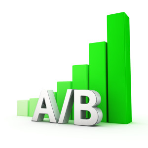
- Consider A/B Testing (Split Testing).
A/B Testing, also known as split testing is one of the best ways to determine the behavior of your customers. In marketing and business intelligence, A/B testing is a scientific method of creating a randomized experiment with two variants. In order to properly construct your A/B test, it is generally recommended to hire an expert due to the scientific nature of properly executing your A/B test. Americaneagle.com has produced a very informational set of four videos explaining A/B testing in depth and you can view them here… https://www.youtube.com/playlist?list=PLaVE3y8LRO-4iDm7Ww9Wx8N3ILPb2Jo9y
With these 5 items in mind, you can come up with a better call-to-action for your business website. As a result, you can drive most visitors to convert to subscribers or even to avail of some of your products and services.